Autumn
Currently...
- 6 members online
- 40,247 total members
- 917,653 total horses
- 1,967 total stables
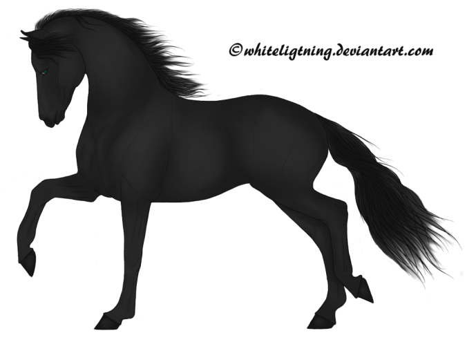
Black horsy critique
| Black horsy critique 1 |
|
|
#39064 Posted on 2016-05-18 00:27:41
I made this today, and I want to know your opinnion:
0 members like this post.
|
Posted By me #64147 Member is Offline 8267 forum posts Send A Message |
|
#39070 Posted on 2016-05-18 05:11:05
For me it's just a little too dark lol, I know that might sound daft as the horse is black but I would lighten it slightly personally. It's a bit hard to see the detail and shading/highlights, although from what I can see there are some nice shading/highlights there. It's also very neat! Well done! :)
0 members like this post.
|
Posted By Endeavour #47503 Member is Offline 211 forum posts Send A Message |
|
#39084 Posted on 2016-05-18 06:42:14
^ what Lex said above.
0 members like this post.
|
Posted By -❆--Buck #53822 Member is Offline 1729 forum posts Send A Message |
|
#39088 Posted on 2016-05-18 07:16:10
Defo too dark! Add a hint of blue like Buck mentioned - quite often if you eyedrop a photo of a black horse, the colours come up a little blue :3
0 members like this post.
|
Posted By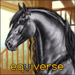 Hoofie #28575 Member is Offline 312 forum posts Send A Message |
|
#39145 Posted on 2016-05-18 10:11:08
I agree, definitely too dark! But if you want to keep it that way then maybe make his/her features stand out, and eyes a little brighter :)
0 members like this post.
|
Posted By Ûµ Pegasusdreamer Ûµ #93994 Member is Offline 1323 forum posts Send A Message |
|
#39177 Posted on 2016-05-18 11:13:52
Ha, it was late at night and I was debating weather or not it was too dark,lol. XD I think I was scared it was going to look like a grayscale. XD Thx guys!
0 members like this post.
|
Posted By me #64147 Member is Offline 8267 forum posts Send A Message |
|
#39183 Posted on 2016-05-18 11:38:35
Is this better?
0 members like this post.
|
Posted By me #64147 Member is Offline 8267 forum posts Send A Message |
|
#39184 Posted on 2016-05-18 11:45:25
well, when I said blue, I meant in the shading of the horse, not so much the background :)
0 members like this post.
|
Posted By -❆--Buck #53822 Member is Offline 1729 forum posts Send A Message |
|
#39185 Posted on 2016-05-18 11:47:42
Ya, the background accidentally did that. I'll fix it when I have time. (: But I'm on my way to see my grandparents, so I won't be able to until Saturdayish. I shall look forward to that day!!!! XD
0 members like this post.
|
Posted By me #64147 Member is Offline 8267 forum posts Send A Message |
|
#39562 Posted on 2016-05-20 08:46:58
remember, highlights are just as important as shading. If you look at it, black horses usually have a blue/gray type of shine to them. some images.
0 members like this post.
|
Posted By Shinku #44201 Member is Offline 193 forum posts Send A Message |
|
#39834 Posted on 2016-05-21 16:05:14
I like this, but I agree, A bit too dark ♥ Maybe add blue, like everyone else said :)
0 members like this post.
|
Posted By Malibu Estate #77601 Member is Offline 601 forum posts Send A Message |
1 |
|


Contact Us Game Support Bug Zapper
Terms and Conditions Code of Conduct Privacy Policy
Game content & programming © equiverse.com 2006-2024 | An OCIA game