Autumn
Currently...
- 14 members online
- 40,358 total members
- 920,564 total horses
- 1,973 total stables
what's it missing?
| what's it missing? 1 |
|
|
#12905 Posted on 2016-03-01 10:58:05
0 members like this post.
|
Posted By Yggdrasil #91895 Member is Offline 446 forum posts Send A Message |
|
#12927 Posted on 2016-03-01 11:14:26
This is lovely! Maybe, (Probably just me) You could shorten the legs? :) But they are fine ;) Maybe in the background a barn? :)
0 members like this post.
|
Posted By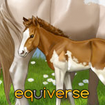 Malibu Estate #77601 Member is Offline 601 forum posts Send A Message |
|
#12932 Posted on 2016-03-01 11:19:11
Im pretty terrible at backgrounds (why it's so simple and empty) but I could try that.
0 members like this post.
|
Posted By Yggdrasil #91895 Member is Offline 446 forum posts Send A Message |
|
#12939 Posted on 2016-03-01 11:27:05
Cool! If you like, I can draw some guidelines for it ;)
0 members like this post.
|
Posted By Malibu Estate #77601 Member is Offline 601 forum posts Send A Message |
|
#13294 Posted on 2016-03-01 19:37:33
I'd say incorporate the legs into the grass a bit more. If it were running through grass, you would be able to see some blades covering the hooves (like I see you've done in your current tag!) And maybe add a bit of a shadow on the grass, underneath the horse.
0 members like this post.
|
Posted By Siren #2811 Member is Offline 2024 forum posts Send A Message |
|
#13321 Posted on 2016-03-01 19:56:43
Thanks Siren. I'm trying to grt the hang of it all still but I'm pretty happy with this considering how little practice I have. I think for this particular tag I might fiddle a little but I'm happy with it. It's not a masterpiece but I'm happy all the same :D
0 members like this post.
|
Posted By Yggdrasil #91895 Member is Offline 446 forum posts Send A Message |
|
#13372 Posted on 2016-03-01 21:11:15
And you definitely should be! Its super awesome nonetheless :D
1 members like this post.
|
Posted By Siren #2811 Member is Offline 2024 forum posts Send A Message |
|
#13390 Posted on 2016-03-01 21:43:39
Hmm I feel like the back I'd a little bit strait maybe if you made it a bit more curved unward? That's just my opinion though?
0 members like this post.
|
Posted By ʟᴀɴᴇʏ #64834 Member is Offline 2448 forum posts Send A Message |
|
#13575 Posted on 2016-03-02 09:07:15
0 members like this post.
|
Posted By Yggdrasil #91895 Member is Offline 446 forum posts Send A Message |
|
#13735 Posted on 2016-03-02 13:29:41
It looks great! I haven't seen what it looked like before, but I love it!
0 members like this post.
|
Posted By Storybrooke #85261 Member is Offline 193 forum posts Send A Message |
1 |
|


Contact Us Game Support Bug Zapper
Terms and Conditions Code of Conduct Privacy Policy
Game content & programming © equiverse.com 2006-2024 | An OCIA game