Autumn
Currently...
- 1 members online
- 40,246 total members
- 917,642 total horses
- 1,967 total stables
Critique Me This
| Critique Me This 1 |
|
|
#35284 Posted on 2016-04-30 08:34:04
0 members like this post.
|
Posted By Bela #25298 Member is Offline 1807 forum posts Send A Message |
|
#35287 Posted on 2016-04-30 08:50:36
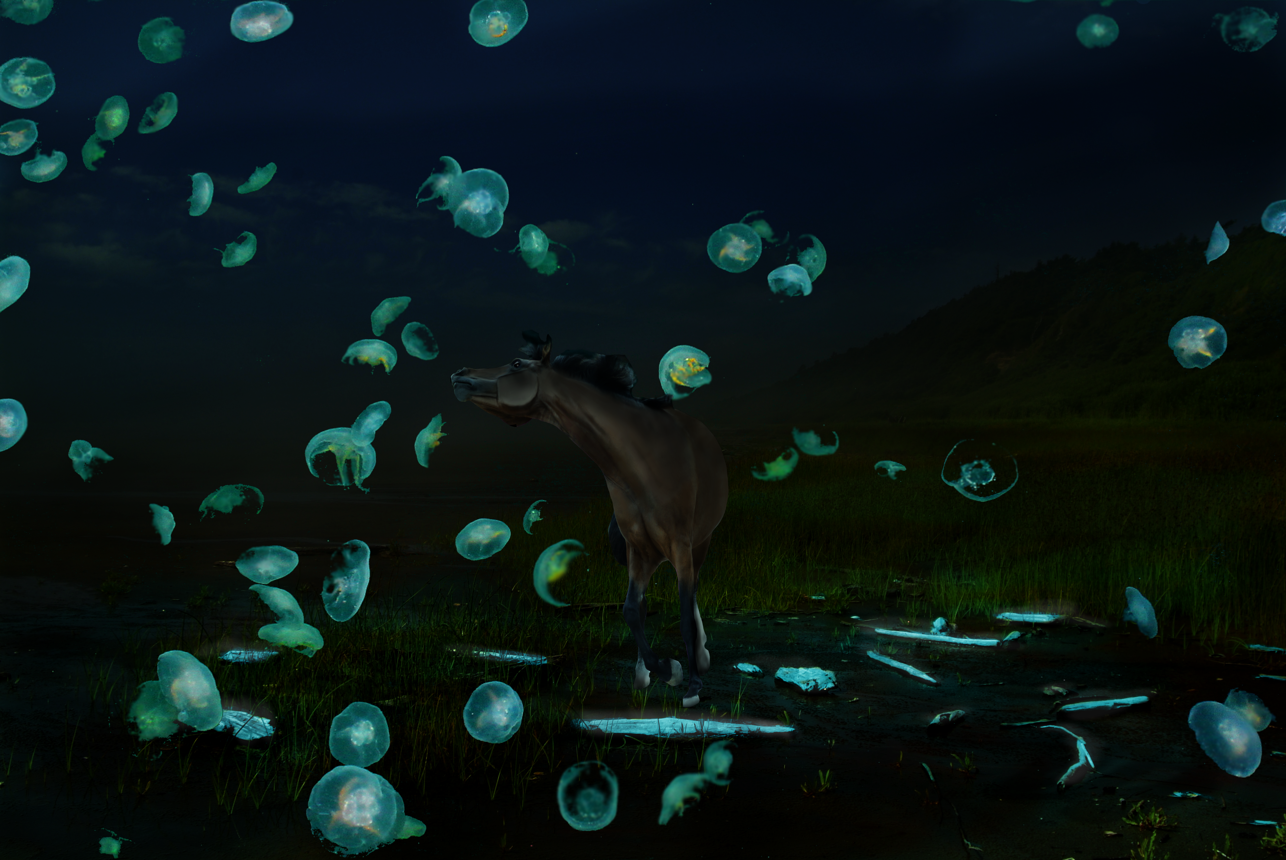
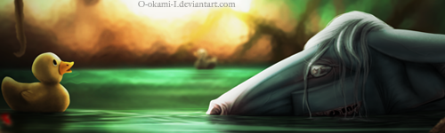
The horse is just a little bit dark for me :) I think the brightness of the jellyfish draws attention away from the horse a little :)
0 members like this post.
|
Posted By Endeavour #47503 Member is Offline 211 forum posts Send A Message |
|
#35288 Posted on 2016-04-30 09:00:48
This turned out really good! :D I still love that head hehe. The jellyfish are very bright, but I personally love that. I think it would look even better if the horse was a bright blue as well. It could be like, the king of jellyfish or something. xD
0 members like this post.
|
Posted By Sylfaen #44290 Member is Offline 780 forum posts Send A Message |
|
#39868 Posted on 2016-05-21 19:13:59
I agree. It looks SO cute, especially the horse, but he probably needs to be a bit lighter or something to make him blend not as much with the sky. Love it, BTW :)
0 members like this post.
|
Posted By Livs #87925 Member is Offline 72 forum posts Send A Message |
1 |
|
Contact Us Game Support Bug Zapper
Terms and Conditions Code of Conduct Privacy Policy
Game content & programming © equiverse.com 2006-2024 | An OCIA game